Saturday 24 September 2011

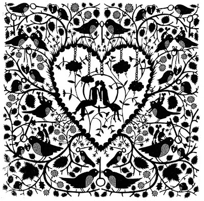
RESEARCH...Rob Ryan

Since the laser cutting session at uni, I've been thinking of ways of incorporating this process into my work.  I'd be able to use this to cut out delicate patterns which would be appropriate for the fragrance bottle.

I've been looking at the work of Rob Ryan who is a visual artist who specialises in paper cuts. I find his work so interesting to look at not only because of the beautifully designed pattern but of the amount of detail that has gone in to each piece. 


For my fragrance bottle I'm thinking of designing a detailed piece which I can then use the laser cutter to precisely cut out my design. I can then take this as a template to glue to the form of the bottle.

WORKSHOP 1: Laser Cutting Session

Today we had an induction to the laser cutters at uni. I briefly used them in my first year so this workshop was a great help in refreshing my memory in using them. We were shown how software such as Adobe Illustrator and Correl Draw can be used to create our designs then simply inputted into the laser cutter.

In my opinion this is a rapid and precise way of cutting intricate detailed designs out in a number of materials. I'll definitely keep this process in mind throughout my designing for my fragrance bottle. This quick technique looks professional and I and can thing about ways of incorporating this process in my work.

While in the session we were all given the opportunity to have a go at using the machines. I have

Friday 23 September 2011

FLUX task 1

FLUX FLUX FLUX....I had a first meeting with my presentation group today in the library for a quick briefing on what we can all go back home and do research on before meeting for a second time with our findings. We thought it would be best not to purely look at our specialism because design is not confined to areas, as they can over lap and intertwine. As a group we all get on pretty well, which is definitely a positive, and nobody seems to be slacking with their work.The topic of flux really interests me, and hopefully researching more into historical changes will help me understand the context of my work more.

HUGO BOSS...Deep Red and Dark Blue

In the design industry when a particular brief is set there is ALWAYS a target audience which the product is aimed at. In this project it depends all on the fragrance which I choose to design a bottle for. I began my research by looking at the two products.

DEEP RED

This is a female produced by Hugo Boss a world renowned company. On the Hugo Boss website it actually says: "HUGO Deep Red is for women who revel in the night, she feels free to express her passion and sensuality".
I first of all look at images of the bottle online however I felt that to get the true feel of the form I physically went to the shops to have a proper look at the product. In my opinion the form was sleek and smooth, this flowing shape instantly screamed it was a feminine fragrance. I was able to know who the company were marketing the fragrance to simply by the bottle which it was in. When holding the bottle to this fragrance I found it to be a very delicate bottle.


DARK BLUE

This is the male equivalent fragrance. What was said on the official website about this product was: "HUGO Dark Blue was designed for men who want to experiment and push the boundaries of pleasure and seduction to the limit. And maybe beyond.
I went through the exact same process with this fragrance and when looking at and handling the product I was able to see and compare how different male and female fragrance bottle actually are. I found the masculine packaging to be a bulkier bottle, which is easier to grip and hold in a larger hand.


This was just a glance initial research into the two products. I want to further look at other products targeting the same market as this will help me to see weather there is general consensus to the products.


Thursday 22 September 2011

Design Specialism: STRUCTURAL DESIGN

I've recently begun my chosen specialism which is structural design. We have been given our first brief not only for our specialist areas but for 2nd year as well. I'm very excited to begin work in this area and from reading through the brief (several times) I know that I've selected well.

THE BRIEF

Design is the manipulation of form and content… 
content is the idea, or subject matter. Form is what you do with this idea. How do I deal with it? Do I use color?… black and white? Do I make it big?… small? Do I make it three-dimensional or two-dimensional? Do I use trendy stuff, or do I use more serious stuff? Do I use Bodoni or do I use Baskerville? These are all the questions you ask. This is part of the manipulative aspect of design”.
Paul Rand   


The brief is about using form as a means of communication. This should be done using a range of 3D skills to develope a new design form for Hugo Boss, Deep Red (female) or Dark Blue (male) fragrance packaging.