I stumbled upon this video on twitter and when I saw it instantly gave me inspiration for this project. The alight event is a celebration of music, dance and visual arts and I believe that this video captured this concept perfectly.
Dentsu London, the same ad agency that recently experimented with iPad light-painting, was recently hired by Canon to create a commercial for the canon Pixma line of printers. They decided to create super close-up and super slow-mo shots of paint dancing by using sound, and created a rig that spins around the paint super fast to create a sense of motion as they shoot at 5000 fps. Have a look at the video...its amazing!
Sunday, 4 December 2011
Saturday, 3 December 2011
Blurred lights
I came across this video on YouTube when researching how to capture lights in motion. I think its interesting that even though the lights are extremely blurred from the way the video has been film you are able to figure out that it is shot inside a car. This yells us that the abstract and distorted lights are actually street lights, signs reflecting and car headlights.
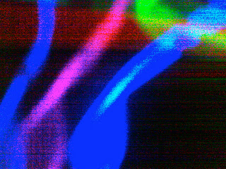
'Into the Night' ...My video
I have been thinking about how I'm going to present my ideas for my tutor and maybe even the client. Instead of having a series of photographs, I could have video footage that I demonstrate my idea with. Here's an example of what I could capture in the 'club environment', I also think this would encourage public participation for the students who would probably gather for this particular part of the day.
More of my photography...expreimentation
I continued to develop my ideas and I wanted to retake my photographs for the 'into the night' event. I used my camera in a different way this time, I slowed the shutter speed down so that when I captured the image, it would look like it was still in motion rather than a still shot.
Technical lingo...
The shutter speed: this is basically the amount of time the shutter is open for.
Shutter speed is measured usually in seconds.
As I was photographing this new set of images, I listened to the type of music which was planned to be played at the 'into the night' event. This reminded me of the kind of 'club scene'.
Here are some of my favourite shots I took. I love the way I have captured the motion of the light, it reflects the movement and genre of dance and music of the is section of the event. I firstly started looking at circular movements to see how they turned out. I also wanted to experiment with colours aswell as shapes.


I think these vibrant, bold neon colours represent the youth of today, their music,dance and visual arts which is perfect for the event. I continued to photograph these glow stick but as you can see i wanted to form different shapes simply by changing the movements and this was all down to the tempo and beat of the music.


Thursday, 1 December 2011
Research continued
Digital Arts Online When researching how I could capture the motion of dance in my photography, I came across this article on the development of how the BBC entertainment graphics. Here are a few still shots of how they have used graphics to create a moving image of a dancer.


I found these amazing videos which has used different genres of music to show hoe dance and movements changes, please take a look...


I found these amazing videos which has used different genres of music to show hoe dance and movements changes, please take a look...
I think this has captured the movement amazingly and it also has realised how movement and dance changes due beat and tempo. I also want to remember this through my own work as the 'ALIGHT' festival celebrates all genres of music from totally different cultures.
Saturday, 26 November 2011
FONTS....Robert Brownjohn
What kind of font do I want on my Logo design for the Alight brand? I want it to be clear and easy to read as well as being diverse as I want it to relate to each of the 3 separate events throughout the day. It must have a professional edge to the typography because this is an organised event which is not only representing Sheffield but also the entire county of Yorkshire. I initially started looking at a plain and simplistic font to have a control on the logo, I looking various books at the library including 'Watching words move' by Ivan Chermayeff and Tom Geismar. I came across the work of Robert Brownjohn and instantly thought it was amazing.

Here are afew examples of Robert Brownjohn's work from the 1960's, his simplistic take on typography was unusual for his time so it definitely stood out and made an impact on design. I personally think his work today is still amazing to look at. Its unique and thats probably what I find memorable about it.

The letters of the word physically represent the meaning of the words, for example above the word 'dead' is showing the last letter to actually be lay down as if it were dead. Clever, simple, and I love it!


These two above are showing how the exactly same words that we use in everyday life can be dramatically changed by technically doing what the word says. On the word adding, letters have been added. On subtracted, letters are missing, on multiplied the beginning of the word has been written out twice. And finally divided the word has been split in to sections. Its actually crazy how nobody had thought of this before him.
Thursday, 24 November 2011
'The Speaker Orchestra'
I stumbled upon this video on youtube and I think its captured the movement of sound amazingly. The heavy beat from the speaker forces the paint into the air. Its almost as if the paint is dancing to the beat of the music. I thought this was so appropriate for my current project on the music dance and visual art festival 'alight'.
RESEARCH...Secondary Images
From finding those posters I then wanted research further into capturing the movement of light photographically. Below is a photo taken by Aidan Stonehouse, I think it looks amazing and your eye automatically follows the trail of light.

When you see images such as these, this is what springs to mind:
- Movement
- Dance
- Flowing
- Rhythm
- Journeys
Here are some more secondary images which have captured the movement of light.


Movement and Light Promotional Posters
I came across these collection of posters when was researching light and movement. I was straight away drawn to these images because of the striking colours and patterns created in the light. I love the way the movement of the figures have been captured in the light, simply using a blurring effect. I think this has inspired me to look into capturing the movement of light, this will show the concept of the dance and music festival 'alight'.


Wednesday, 23 November 2011
More designs
I started to look at incorporating musical notes into my logo designs. I wanted to use a similar back ground to my first ideas, but still develop the idea.

I can use bright colours to my it eye catching to the public. I know above I haven't looked at using the letters yet to spell out alight, but I'm was think of how I can use the music not to spell out 'alight'.
I can up with this (below) where the letter 'A' is the stem of the note. You can see the pencil lines on my sketch to where the letters would be placed on the logo.

Researching Musical logos
I also wanted to look at how Music could be incorporated in to the branding and logo. I have been researching how other companies and bands have done this previously, some I think are successful where others are definitely not.

I think this have worked using the cable to bring the logo together. Its clearly a live performance and by using the 'live wire' this visually represents the brand.

Here this 'one man band' has used manuscript as well as several musical instruments. I think this works well but is it a bit too predictable? I want my design to be MEMORABLE and not predictable.
 To me this a very unsuccessful logo, it may include a musical note however its plain, and quite boring to look at. The colours are simplistic and they don't make the logo any more interesting. From looking at these few examples I'm going to start exploring ways I can incorporate musical notes or instruments.
I think this have worked using the cable to bring the logo together. Its clearly a live performance and by using the 'live wire' this visually represents the brand.
Here this 'one man band' has used manuscript as well as several musical instruments. I think this works well but is it a bit too predictable? I want my design to be MEMORABLE and not predictable.
Tuesday, 22 November 2011
My Photography
I wanted explore capturing the movement of dance but in the form of light. I began by looking at light and how through movement and dance the light can be distorted and blurred. I have only selected a few of my favourite images otherwise we'd be here all day looking at them.


What I love about these is the merging of colours, and from these images you get an idea of the music that they represent. This is obviously a 'club scene'. I captured this images in a dark room and only used glow sticks as a source of light. I asked a few of my friends to use the glow stick to create movement and whilst I captured the images.
Monday, 21 November 2011
Second Structural Session
After going home and coming up with as many ides as I could (until my head hurt) in our second session this is where as a group we could go through all of our work. This session definitely helped me with my ideas as i found what i really need to focus on is 'what is the message'. This is so important as I don't want to stray from the brief. I found talking not only to Glyn, my tutor, but also my peers very helpful as from there views I'm able to improve upon and develop my ideas.
More Ideas!
From my first ideas I have now worked upon this and looked at using a stencil to allow light to shine through the cut outs. I have simply removed the lettering to spell out 'ALIGHT' and here are some images of this stencil.
 By shinning a torch behind the card it has let through traces of the light. I do quite like this effect, and I want to incorporate using light into my ideas. I'm going to think about how light can capture movement, dance and music. I want to also explore the 3 separate events within the entire day:
Alight - Daytime
Alight - Twilight
Alight - Into the Night


Alight - Daytime
Alight - Twilight
Alight - Into the Night

Sunday, 20 November 2011
RESEARCH: Dance and music festivals
I have began by looking at already existing music/dance festival logos and branding. These events around the world are of similar nature to Alight. Here is what i found below.
MUSIC FESTIVALS
 The Creamfields logo is a plane font on a bold and vibrant background. Not only does it have the typography element but there is a unique symbol which is recognised globally as the cream sign. Some photography can subtly be seen in the background, showing the enjoyment of the event. The colours are gradually merging into one another, and they are bright representing the summer vibes and the upbeat music.

Again the Global Gathering branding contains to separate logos, which can be put together. However they both work just as well individually. The type is simplistic and easy to read. There is only 3 or 4 main colours used here, so its not overpowering.
 This is a much more simple in the layout as well as the colours. However the simplistic colour scheme represent the type of traditional music played at the festival. Also I like the way the logo has included a music note which also is the letter J, this automatically shows that it's a music festival. Also in my opinion I think this note could also be seen as an abstract figure dancing to the music. I want to experiment ways of getting this across in my own work.
DANCE FESTIVAL
 This logo is bold and very eye catching. It has included images in the background of the t, however it hasn't distracted the important information, the name of the festival.

This logo is very simple but the image of the figure represents the style of dance that is happening at the event. The type is very simple also, i think its rather predicable which i definitely want to stay clear of my designing my logo.

When representing different styles of dance and music the logo is there to show this through the design and layout. Here the salsa festival is made up of fun summer colours as it originates from a hot country. The style of font is not that easy read at a glance.
From analysing these music and dance festival logos it has given clearer vision of what i must do to make my logo successful for the Alight Festival. For my design to be effective I must:
MUSIC FESTIVALS


Again the Global Gathering branding contains to separate logos, which can be put together. However they both work just as well individually. The type is simplistic and easy to read. There is only 3 or 4 main colours used here, so its not overpowering.
DANCE FESTIVAL
This logo is very simple but the image of the figure represents the style of dance that is happening at the event. The type is very simple also, i think its rather predicable which i definitely want to stay clear of my designing my logo.

When representing different styles of dance and music the logo is there to show this through the design and layout. Here the salsa festival is made up of fun summer colours as it originates from a hot country. The style of font is not that easy read at a glance.
From analysing these music and dance festival logos it has given clearer vision of what i must do to make my logo successful for the Alight Festival. For my design to be effective I must:
- make sure the design is bold
- have a memorable design that must also be unique
- communicate visually
- the logo should reflect the theme of the festival - all music genres and dance styles, from a number of culture and countries.
Saturday, 19 November 2011
Initial ALIGHT Branding Ideas
At the beginning of my thought process I wanted the logo to be bold and eye catching. I knew that the festival was a celebration of music, dance and visual arts and my aim was to capture this in my logo designs. I firstly began looking at a simple colour scheme of just black, grey and white.

I have used oil pastels to get this 'explosion' effect in the background of the piece and then cut out the text to be stuck on top. This was a good starting point for me, however I will develop upon these initial ideas until I feel I have completed the brief to the best of my ability.
From this I want to think about ways of incorporating the theme of music and dance in to my logo. I will think about colours and patterns for my development pieces.
Wednesday, 16 November 2011
First Structural Meeting
In the meeting with Glyn it was straight after the 'meet the client' session. I found that the whole group thought that when meeting the client it was very negative and the guidelines were vague. However in our structural group session I felt more confident with the project as a whole. Rather than focusing on one particular aspect of the brief, we firstly were told to get ALL of our ideas down for each section of the brief. This helped me to see the link with each section.
- Branding
- Artefact
- Street Art
- Projections
Tuesday, 15 November 2011
PROFESSIONAL PRACTICE BRIEF
So at the end of last week we received our newest brief, which is a live brief. At first this was quite daunting to hear but after the 'meet the client' session today I'm really excited at where I can go with this project. In todays session we were told the constrictions of the actually project, which is mainly down to funding and the expense of production. I suppose this is exactly what happens in the 'real world'.
ALIGHT based in sheffield, is one of 15 major music projects created for this national event. However it is the only one in the Yorkshire area, so its representing the county. The event is a celebration of
Here's a link to the events website where all of the event information can be found.
http://www.alightmusicnation.co.uk/
ALIGHT based in sheffield, is one of 15 major music projects created for this national event. However it is the only one in the Yorkshire area, so its representing the county. The event is a celebration of
- Dance
- Music
- Visual Arts
The Alight project will take place over 3 segments on Saturday 3rd March 2012. Those 3 segments are:
- Alight: Daylight
- Alight: Twilight
- Alight: Into the Night
Here's a link to the events website where all of the event information can be found.
http://www.alightmusicnation.co.uk/
Tuesday, 8 November 2011
MY ACTION PLAN
So after completing my brief for this project, I've reflected upon the entire process and I will now put together and action plan. Within the action plan I will clearly outline how I can enhance and develop my skills and knowledge in the future. My objectives will be SMART:
Specific
Measurable
Achievable
Realistic
Time constrained
Structural Design Skills I will continues to develop and improve my skills, where I become more confident in using the equipment. I will continue to attend all of my tutorial sessions led by my specialist tutor, and within these sessions I'll ask questions to improve my understanding on my specialism. Also I will continue to look at books and research designers relating to my area, this will allow me to admire the work of other successful designers for inspiration. I will be able to use the feedback from my tutor to see which areas they believe I need to improve and I can take this onboard from my next brief.
Listen To Feedback At all my assessments and tutorials, I must listen and act upon all of my feedback that is given to me. This will help e further identify my strengths and also my weaknesses within my specialism. I can then work on my areas of weakness by paying greater attention to them. I will continually be working upon these areas over the next two years of university, and hopefully they wont be my weaknesses anymore.
Work Experience I believe it is important that I begin to look into work experience while I'm studying my degree. This way I will have experience in a professional working environment in my chosen area. I will then be able to say I've worked in the real industry which is totally different to the university environment. Ideally I will complete my work experience during the summer 2012.
Software Skills For me to blossom in structural design I must improve my software skills so that I know my was confidently around the main programs. I will be focusing on Adobe Illustrator and Coral Draw. From improving these skills I can then input my digitally draw work and use the laser cutting machines to cut out any patters/designs or typography. I have previously been looking at tutorials on the Adobe website and also on Youtube. My improvements to these and other programs will be an ongoing process throughout my time at university and further on in my career.
Monday, 7 November 2011
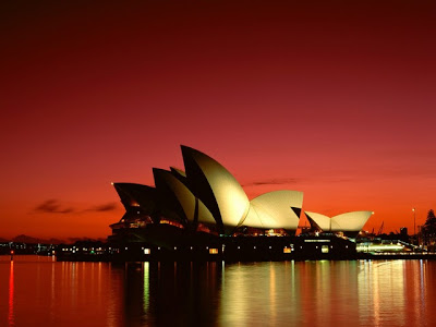
Architecture..FORM and SHAPE
The architect of the Sydney Opera House is Jorn Utzon. In my opinion its a masterpiece. BUT what I'm interested in is what inspired his work to produce these shape and form, which are know throughout the world as the sydney opera house. In fact its an expressionist design, of a series of large precast concrete "shells". According to sources the shell like exterior is suppose to represent the sails of the tall sailing ship that brought so many modern anglo residents to the country.


Sydney Opera House
From developing the form of my new bottle design I recently had a few models lined up in front of me and I mad a link with the Sydney Opera House. Strangely I think the shape of this building is very similar to aspects of the new bottle. Here are some secondary images of this architectural piece I found on the internet. I think these show off the curve of the building beautifully.


Wednesday, 26 October 2011
Surface design...RESEARCH
I've been looking at surface designs for my own bottle, I want the design to be ORGANIC and NATURAL. So I've been looking at some pieces for inspiration, I found these secondary images on the internet whilst researching.


I was drawn to these pieces whilst browsing the web because of it form of the swirls, however I think for what Im thinking of drawing they is too structured. It doesn't seem naturally formed. However this is the idea I want to show in my design, is the image of growth. When I look at these two above it automatically reminds me of growing and developing.

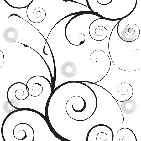

I want this to be combined in the design because for this brief I am developing the bottle design, so on the surface of the bottle I thought I could show this development and growth visually.
I saw this bottle which I had to include on my blog, I just love it!!! The detail in the pattern is beautiful and you can well and truly tell its a design for a female fragrance bottle.

Monday, 24 October 2011
DIAMONDS are a girls best friend
From looking at fragrance bottles in the shops I know that some geometric shaped bottles do not always give off a masculine sense. For example bottles such as Lady Million by Paco Rabanne remind me of a gem or a jewel. This instantly screams femininity. Its form is like an oversized diamond on a ring, so from this does that mean that it is an exclusive range of fragrance?
 This bottle represents:

From comparing the bottle to the image of the diamonds you can clearly see the similarities, the way the straight harsh edges glisten.

- High quality
- Wealth
- Expensive taste
This is purely from the form of the bottle....

From comparing the bottle to the image of the diamonds you can clearly see the similarities, the way the straight harsh edges glisten.
Sunday, 23 October 2011
DEVELOPMENT of my ideas
From the original shape and form of the bottle 'Deep Red' I wanted to not just alter the shape but completely change it with my own twist on things. I thought what better way to do that then to use the negative space around the bottle...you're probably thinking WHAT?! But wait let me explain further.
I have sketched out the basic original shape and place a box around it. Now you can clearly see the negative space around the bottle. I've began to look at how these cut offs and how I can create a new form for the bottle using these.

I have sketched out the basic original shape and place a box around it. Now you can clearly see the negative space around the bottle. I've began to look at how these cut offs and how I can create a new form for the bottle using these.
Subscribe to:
Posts (Atom)